荣获多项国际设计大奖,多个单品销量过亿
好设计=好生意
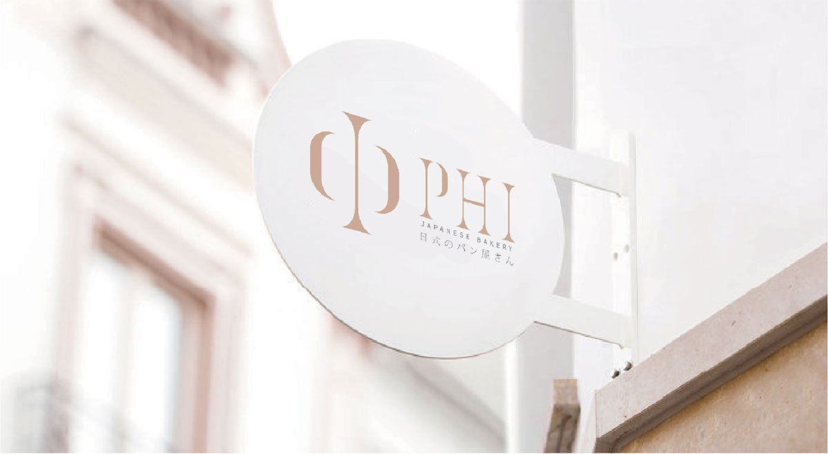
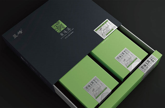
客户:PHI
作品名称:PHI
设计项目:烘培
设计团队:JRD 金睿达
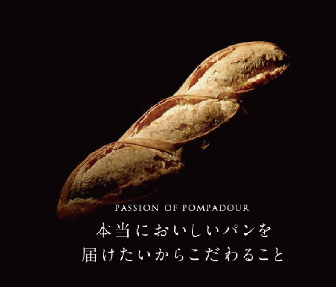
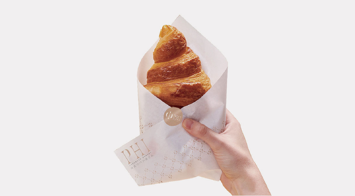
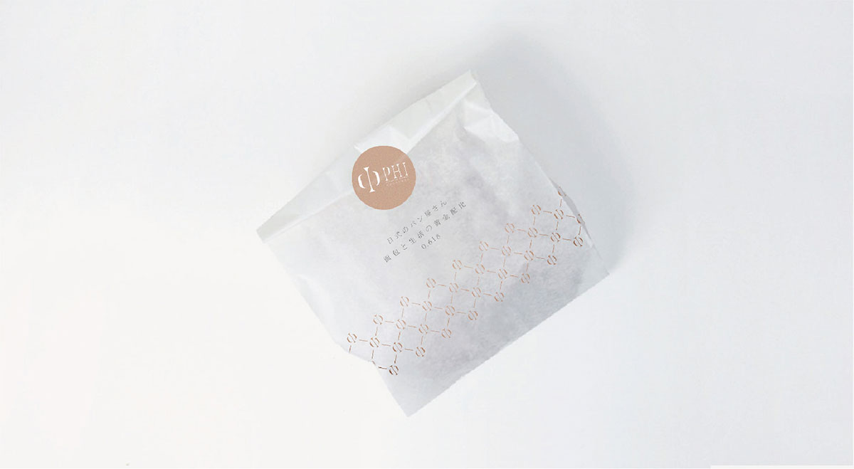
PHI是黄金分割的意思,我们在选用名字的时候把这种黄金分割和制作面包的黄金配比去做融合,使得品牌和产品属性更加融合,整个设计以黑金为主,精致高级。
PHl is the meaning of the qolden section. When we choose the name, we integratethis golden section with the gold ratio of making bread, so that the brand and producattributes are more integrated. The whole desian is mainly black gold, exquisite andadvanced.